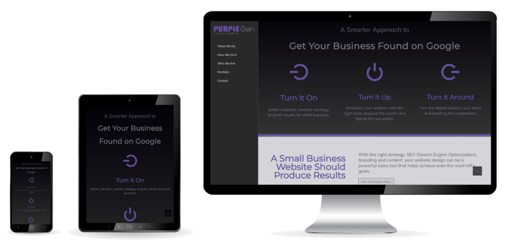
Why Good Mobile Website Design is Important
More than half of all searches come from small devices
If you have an older website that doesn’t work well on a mobile device with a small screen, you’re going to lose business, and Google SEO rank.
Don’t lose customers or Google search rank because of a non-responsive site.
Because more than half of all internet searches occur on mobile phones and devices with small screens, and the numbers keep growing, Google uses mobile responsiveness a key factor to delivering relevant search results to a user.
A website that doesn’t respond to screen size isn’t going to rank as well as one that does.
It is part of Google’s main goal to create a great user experience. They constantly work towards that goal themselves, and expect others to do the same.
Gone are the days where you had an entirely different URL for a mobile site (it usually was something like www.m.yourwebsite.com). Today, Google wants you to have one website that looks great on any size screen. From huge Smart TV screens to small mobile phone screens, one website for all.
News sites respond differently on any size screen. (yes, your device knows how big it is). A responsive site eliminates horizontal scrolling, and ‘stacks’ rows and columns on top of each other as screens get smaller.
How Mobile Website Design Works
Responsive site design is an entirely different way of building a website.
Older websites looked more like a ‘brochure’ where you could put elements generally anywhere you wanted.
Mobile site design works more like a grid, using rows and columns that respond to the screen size. When viewing on a large screen, the spread out side-by-side. When viewing on a small screen, the stack on top of each other.
Can a current site be updated to be responsive?
Although most website builder systems can ‘convert’ your current site to be mobile responsive, it usually delivers mediocre results. They’re trying to put a band-aid on cut that needs stitches.
For the best possible results, we suggest starting with an entirely new page builder system, and adapting your content to work with it.
If your site is old enough to be incompatible with small screens, it’s probably due for a complete overhaul anyways. What a great time to enhance your branding, improve your content too!
Assets needed for responsive design:
More from the Blog
Purple Jen
I’ve worked in marketing, strategy, SEO and paid search for nearly 25 years, and as a freelance website designer for 13 years. My approach to web marketing: strategize. maximize. analyze. repeat. came from learning about my own personal strengths. Not only were they my Strength Finder talents, but together they create a solid, simplified approach to successful marketing. I like to write about that stuff here, and share my knowledge to help fellow small business owners achieve more, and see the world through purple colored glasses. Jen Lorenski


